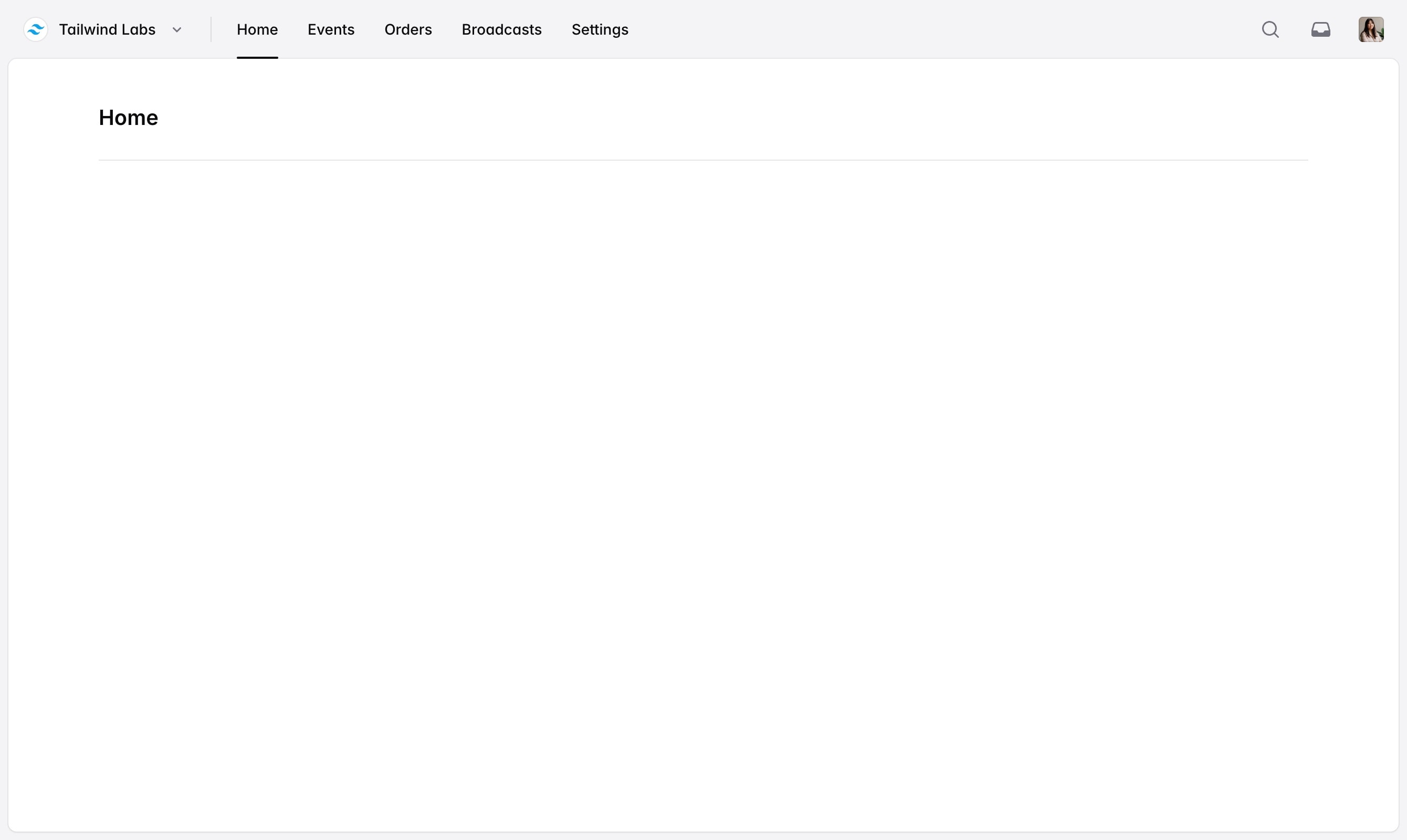
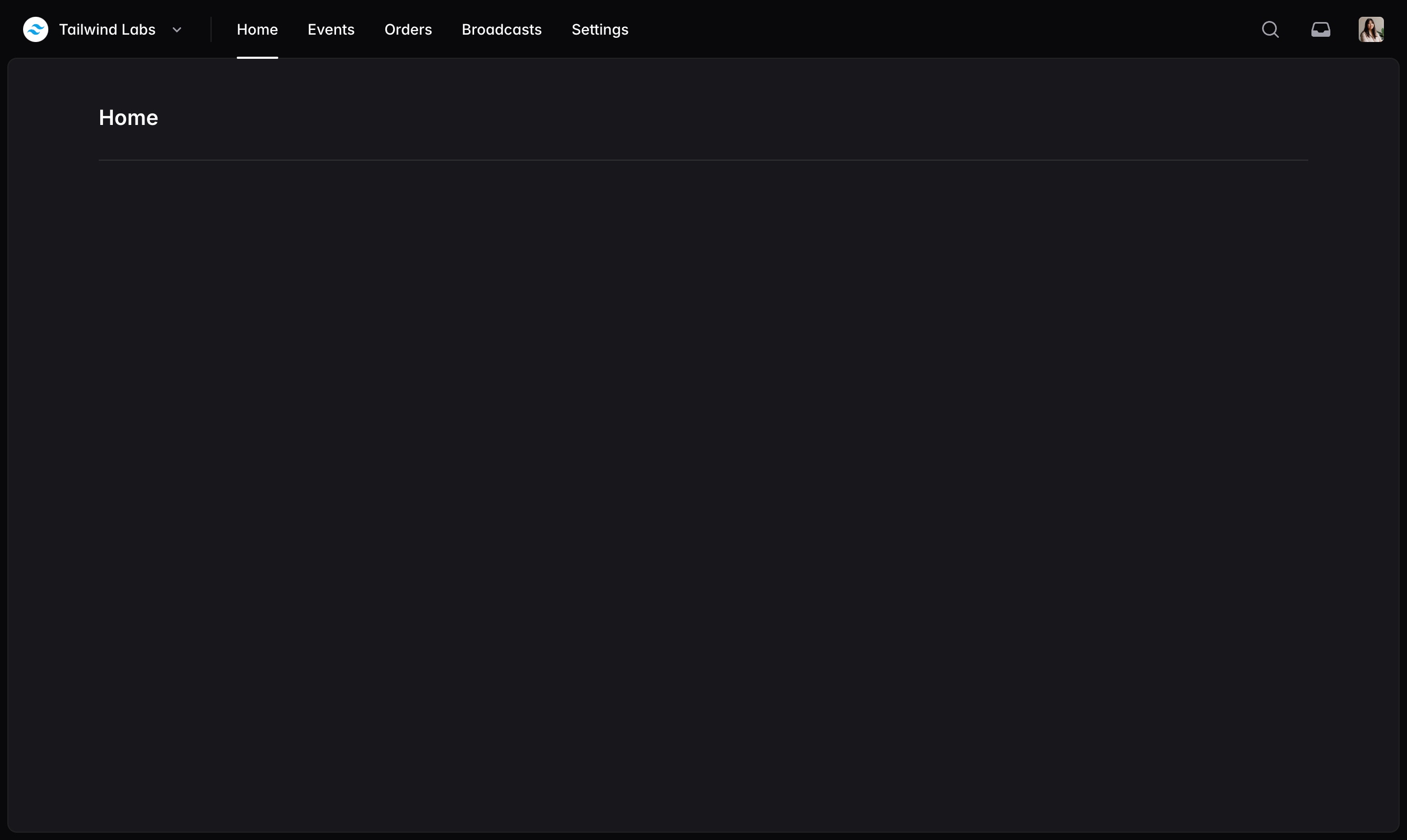
Navbar
No one ever got fired for starting a website with a horizontal navigation menu.
import { Avatar } from '@/components/avatar'
import {
Dropdown,
DropdownButton,
DropdownDivider,
DropdownItem,
DropdownLabel,
DropdownMenu,
} from '@/components/dropdown'
import { Navbar, NavbarDivider, NavbarItem, NavbarLabel, NavbarSection, NavbarSpacer } from '@/components/navbar'
import {
ArrowRightStartOnRectangleIcon,
ChevronDownIcon,
Cog8ToothIcon,
LightBulbIcon,
PlusIcon,
ShieldCheckIcon,
UserIcon,
} from '@heroicons/react/16/solid'
import { InboxIcon, MagnifyingGlassIcon } from '@heroicons/react/20/solid'
function Example() {
return (
<Navbar>
<Dropdown>
<DropdownButton as={NavbarItem}>
<Avatar src="/tailwind-logo.svg" />
<NavbarLabel>Tailwind Labs</NavbarLabel>
<ChevronDownIcon />
</DropdownButton>
<DropdownMenu className="min-w-64" anchor="bottom start">
<DropdownItem href="/teams/1/settings">
<Cog8ToothIcon />
<DropdownLabel>Settings</DropdownLabel>
</DropdownItem>
<DropdownDivider />
<DropdownItem href="/teams/1">
<Avatar slot="icon" src="/tailwind-logo.svg" />
<DropdownLabel>Tailwind Labs</DropdownLabel>
</DropdownItem>
<DropdownItem href="/teams/2">
<Avatar slot="icon" initials="WC" className="bg-purple-500 text-white" />
<DropdownLabel>Workcation</DropdownLabel>
</DropdownItem>
<DropdownDivider />
<DropdownItem href="/teams/create">
<PlusIcon />
<DropdownLabel>New team…</DropdownLabel>
</DropdownItem>
</DropdownMenu>
</Dropdown>
<NavbarDivider className="max-lg:hidden" />
<NavbarSection className="max-lg:hidden">
<NavbarItem href="/" current>
Home
</NavbarItem>
<NavbarItem href="/events">Events</NavbarItem>
<NavbarItem href="/orders">Orders</NavbarItem>
</NavbarSection>
<NavbarSpacer />
<NavbarSection>
<NavbarItem href="/search" aria-label="Search">
<MagnifyingGlassIcon />
</NavbarItem>
<NavbarItem href="/inbox" aria-label="Inbox">
<InboxIcon />
</NavbarItem>
<Dropdown>
<DropdownButton as={NavbarItem}>
<Avatar src="/profile-photo.jpg" square />
</DropdownButton>
<DropdownMenu className="min-w-64" anchor="bottom end">
<DropdownItem href="/my-profile">
<UserIcon />
<DropdownLabel>My profile</DropdownLabel>
</DropdownItem>
<DropdownItem href="/settings">
<Cog8ToothIcon />
<DropdownLabel>Settings</DropdownLabel>
</DropdownItem>
<DropdownDivider />
<DropdownItem href="/privacy-policy">
<ShieldCheckIcon />
<DropdownLabel>Privacy policy</DropdownLabel>
</DropdownItem>
<DropdownItem href="/share-feedback">
<LightBulbIcon />
<DropdownLabel>Share feedback</DropdownLabel>
</DropdownItem>
<DropdownDivider />
<DropdownItem href="/logout">
<ArrowRightStartOnRectangleIcon />
<DropdownLabel>Sign out</DropdownLabel>
</DropdownItem>
</DropdownMenu>
</Dropdown>
</NavbarSection>
</Navbar>
)
}
Component API
| Prop | Default | Description |
|---|---|---|
Navbar extends the JSX <div> element | ||
| This component does not expose any component-specific props. | ||
NavbarDivider extends the JSX <div> element | ||
| This component does not expose any component-specific props. | ||
NavbarSection extends the JSX <div> element | ||
| This component does not expose any component-specific props. | ||
NavbarSpacer extends the JSX <div> element | ||
| This component does not expose any component-specific props. | ||
NavbarItem extends the Headless UI Button component or the Link component | ||
current | - | Whether or not it is the current navigation item. |
href | - | The target URL when using the button as a link. |
NavbarLabel extends the JSX <span> element | ||
| This component does not expose any component-specific props. | ||
Examples
Basic example
Use the Navbar, NavbarSection and NavbarItem components to build a basic navbar with navigation links:
import { Navbar, NavbarItem, NavbarSection } from '@/components/navbar'

function Example() {
  return (
    <Navbar>
      <NavbarSection>
        <NavbarItem href="/">Home</NavbarItem>
        <NavbarItem href="/events">Events</NavbarItem>
        <NavbarItem href="/orders">Orders</NavbarItem>
      </NavbarSection>
    </Navbar>
  )
}
The NavbarItem component can be used either as a Link by providing an href prop or as a Button by omitting the
href prop.
With logo
Add your own logo as an image or component at the beginning of your navbar:
import { Link } from '@/components/link'
import { Navbar, NavbarItem, NavbarSection } from '@/components/navbar'
import { Logo } from './logo'

function Example() {
  return (
    <Navbar>
      <Link href="/" aria-label="Home">
        <Logo className="size-10 sm:size-8" />
      </Link>
      <NavbarSection>
        <NavbarItem href="/" current>
          Home
        </NavbarItem>
        <NavbarItem href="/events">Events</NavbarItem>
        <NavbarItem href="/orders">Orders</NavbarItem>
      </NavbarSection>
    </Navbar>
  )
}
To best fit the navbar design, we recommend making your logo 40px tall at mobile sizes, and 32px tall at the sm
breakpoint above.
With active state
Use the current prop to specify which NavbarItem is the current navigation item:
import { Navbar, NavbarItem, NavbarSection } from '@/components/navbar'
import { Logo } from './logo'

function Example() {
  return (
    <Navbar>
      <Link href="/" aria-label="Home">
        <Logo className="size-10 sm:size-8" />
      </Link>
      <NavbarSection>
        <NavbarItem href="/" current>
          Home
        </NavbarItem>
        <NavbarItem href="/events">Events</NavbarItem>
        <NavbarItem href="/orders">Orders</NavbarItem>
      </NavbarSection>
    </Navbar>
  )
}
With icon links
Use an icon as the only child of a NavbarItem to create icon-only links:
import { Navbar, NavbarItem, NavbarSection, NavbarSpacer } from '@/components/navbar'
import { InboxIcon, MagnifyingGlassIcon } from '@heroicons/react/20/solid'
import { Logo } from './logo'

function Example() {
  return (
    <Navbar>
      <Link href="/" aria-label="Home">
        <Logo className="size-10 sm:size-8" />
      </Link>
      <NavbarSpacer />
      <NavbarSection>
        <NavbarItem href="/search" aria-label="Search">
          <MagnifyingGlassIcon />
        </NavbarItem>
        <NavbarItem href="/inbox" aria-label="Inbox">
          <InboxIcon />
        </NavbarItem>
      </NavbarSection>
    </Navbar>
  )
}
When using icon-only links, make sure to provide an aria-label for assistive technology.
The NavbarItem component is designed to work best with 20×20 icons.
If you're using your own custom icons, make sure they include the data-slot="icon" prop so they receive the correct
styles.
With space between items
Use the NavbarSpacer component to add space between items in the navbar:
import { Navbar, NavbarItem, NavbarSection, NavbarSpacer } from '@/components/navbar'
import { InboxIcon, MagnifyingGlassIcon } from '@heroicons/react/20/solid'
import { Logo } from './logo'

function Example() {
  return (
    <Navbar>
      <Link href="/" aria-label="Home">
        <Logo className="size-10 sm:size-8" />
      </Link>
      <NavbarSpacer />
      <NavbarSection>
        <NavbarItem href="/search" aria-label="Search">
          <MagnifyingGlassIcon />
        </NavbarItem>
        <NavbarItem href="/inbox" aria-label="Inbox">
          <InboxIcon />
        </NavbarItem>
      </NavbarSection>
    </Navbar>
  )
}
With divider
Use the NavbarDivider component to add a dividing line between items in the navbar:
import { Navbar, NavbarDivider, NavbarItem, NavbarSection } from '@/components/navbar'
import { Logo } from './logo'

function Example() {
  return (
    <Navbar>
      <Link href="/" aria-label="Home">
        <Logo className="size-10 sm:size-8" />
      </Link>
      <NavbarDivider />
      <NavbarSection>
        <NavbarItem href="/">Home</NavbarItem>
        <NavbarItem href="/events">Events</NavbarItem>
        <NavbarItem href="/orders">Orders</NavbarItem>
      </NavbarSection>
    </Navbar>
  )
}
With dropdown
Use the Dropdown component add a dropdown menu to a navbar by rendering the DropdownButton as a NavbarItem:
import { Avatar } from '@/components/avatar'
import {
Dropdown,
DropdownButton,
DropdownDivider,
DropdownItem,
DropdownLabel,
DropdownMenu,
} from '@/components/dropdown'
import { Navbar, NavbarItem, NavbarLabel, NavbarSection, NavbarSpacer } from '@/components/navbar'
import { ChevronDownIcon, Cog8ToothIcon, PlusIcon } from '@heroicons/react/16/solid'
import { InboxIcon, MagnifyingGlassIcon } from '@heroicons/react/20/solid'
function Example() {
return (
<Navbar>
<Dropdown>
<DropdownButton as={NavbarItem} aria-label="Account menu">
<Avatar src="/tailwind-logo.svg" />
<NavbarLabel>Tailwind Labs</NavbarLabel>
<ChevronDownIcon />
</DropdownButton>
<DropdownMenu className="min-w-64" anchor="bottom start">
<DropdownItem href="/teams/1/settings">
<Cog8ToothIcon />
<DropdownLabel>Settings</DropdownLabel>
</DropdownItem>
<DropdownDivider />
<DropdownItem href="/teams/1">
<Avatar slot="icon" src="/tailwind-logo.svg" />
<DropdownLabel>Tailwind Labs</DropdownLabel>
</DropdownItem>
<DropdownItem href="/teams/2">
<Avatar slot="icon" initials="WC" className="bg-purple-500 text-white" />
<DropdownLabel>Workcation</DropdownLabel>
</DropdownItem>
<DropdownDivider />
<DropdownItem href="/teams/create">
<PlusIcon />
<DropdownLabel>New team…</DropdownLabel>
</DropdownItem>
</DropdownMenu>
</Dropdown>
<NavbarSpacer />
<NavbarSection>
<NavbarItem href="/search" aria-label="Search">
<MagnifyingGlassIcon />
</NavbarItem>
<NavbarItem href="/inbox" aria-label="Inbox">
<InboxIcon />
</NavbarItem>
</NavbarSection>
</Navbar>
)
}
See the Dropdown docs for more information on building dropdown menus.
With avatar dropdown
Use the Dropdown component with an Avatar to add an avatar-only dropdown to a navbar:
import { Avatar } from '@/components/avatar'
import { Dropdown, DropdownDivider, DropdownItem, DropdownLabel, DropdownMenu } from '@/components/dropdown'
import { Navbar, NavbarItem, NavbarSpacer } from '@/components/navbar'
import {
  ArrowRightStartOnRectangleIcon,
  Cog8ToothIcon,
  LightBulbIcon,
  ShieldCheckIcon,
  UserIcon,
} from '@heroicons/react/16/solid'
import { Logo } from './logo'

function Example() {
  return (
    <Navbar>
      <Link href="/" aria-label="Home">
        <Logo className="size-10 sm:size-8" />
      </Link>
      <NavbarSpacer />
      <Dropdown>
        <DropdownButton as={NavbarItem} aria-label="Account menu">
          <Avatar src="/profile-photo.jpg" square />
        </DropdownButton>
        <DropdownMenu className="min-w-64" anchor="bottom end">
          <DropdownItem href="/my-profile">
            <UserIcon />
            <DropdownLabel>My profile</DropdownLabel>
          </DropdownItem>
          <DropdownItem href="/settings">
            <Cog8ToothIcon />
            <DropdownLabel>Settings</DropdownLabel>
          </DropdownItem>
          <DropdownDivider />
          <DropdownItem href="/privacy-policy">
            <ShieldCheckIcon />
            <DropdownLabel>Privacy policy</DropdownLabel>
          </DropdownItem>
          <DropdownItem href="/share-feedback">
            <LightBulbIcon />
            <DropdownLabel>Share feedback</DropdownLabel>
          </DropdownItem>
          <DropdownDivider />
          <DropdownItem href="/logout">
            <ArrowRightStartOnRectangleIcon />
            <DropdownLabel>Sign out</DropdownLabel>
          </DropdownItem>
        </DropdownMenu>
      </Dropdown>
    </Navbar>
  )
}
Make sure to provide an aria-label for assistive technology when using avatar-only dropdowns. See the
Dropdown docs for more information on how to build a dropdown menu.
With mobile menu
If you'd like to add a mobile menu to a navbar, use the StackedLayout component which includes
a navbar and a sidebar for mobile:
import { Avatar } from '@/components/avatar'
import {
Dropdown,
DropdownButton,
DropdownDivider,
DropdownItem,
DropdownLabel,
DropdownMenu,
} from '@/components/dropdown'
import { Navbar, NavbarDivider, NavbarItem, NavbarLabel, NavbarSection, NavbarSpacer } from '@/components/navbar'
import { Sidebar, SidebarBody, SidebarHeader, SidebarItem, SidebarLabel, SidebarSection } from '@/components/sidebar'
import { StackedLayout } from '@/components/stacked-layout'
import {
ArrowRightStartOnRectangleIcon,
ChevronDownIcon,
Cog8ToothIcon,
LightBulbIcon,
PlusIcon,
ShieldCheckIcon,
UserIcon,
} from '@heroicons/react/16/solid'
import { InboxIcon, MagnifyingGlassIcon } from '@heroicons/react/20/solid'
const navItems = [
{ label: 'Home', url: '/' },
{ label: 'Events', url: '/events' },
{ label: 'Orders', url: '/orders' },
{ label: 'Broadcasts', url: '/broadcasts' },
{ label: 'Settings', url: '/settings' },
]
function TeamDropdownMenu() {
return (
<DropdownMenu className="min-w-80 lg:min-w-64" anchor="bottom start">
<DropdownItem href="/teams/1/settings">
<Cog8ToothIcon />
<DropdownLabel>Settings</DropdownLabel>
</DropdownItem>
<DropdownDivider />
<DropdownItem href="/teams/1">
<Avatar slot="icon" src="/tailwind-logo.svg" />
<DropdownLabel>Tailwind Labs</DropdownLabel>
</DropdownItem>
<DropdownItem href="/teams/2">
<Avatar slot="icon" initials="WC" className="bg-purple-500 text-white" />
<DropdownLabel>Workcation</DropdownLabel>
</DropdownItem>
<DropdownDivider />
<DropdownItem href="/teams/create">
<PlusIcon />
<DropdownLabel>New team…</DropdownLabel>
</DropdownItem>
</DropdownMenu>
)
}
function Example() {
return (
<StackedLayout
navbar={
<Navbar>
<Dropdown>
<DropdownButton as={NavbarItem} className="max-lg:hidden">
<Avatar src="/tailwind-logo.svg" />
<NavbarLabel>Tailwind Labs</NavbarLabel>
<ChevronDownIcon />
</DropdownButton>
<TeamDropdownMenu />
</Dropdown>
<NavbarDivider className="max-lg:hidden" />
<NavbarSection className="max-lg:hidden">
{navItems.map(({ label, url }) => (
<NavbarItem key={label} href={url}>
{label}
</NavbarItem>
))}
</NavbarSection>
<NavbarSpacer />
<NavbarSection>
<NavbarItem href="/search" aria-label="Search">
<MagnifyingGlassIcon />
</NavbarItem>
<NavbarItem href="/inbox" aria-label="Inbox">
<InboxIcon />
</NavbarItem>
<Dropdown>
<DropdownButton as={NavbarItem}>
<Avatar src="/profile-photo.jpg" square />
</DropdownButton>
<DropdownMenu className="min-w-64" anchor="bottom end">
<DropdownItem href="/my-profile">
<UserIcon />
<DropdownLabel>My profile</DropdownLabel>
</DropdownItem>
<DropdownItem href="/settings">
<Cog8ToothIcon />
<DropdownLabel>Settings</DropdownLabel>
</DropdownItem>
<DropdownDivider />
<DropdownItem href="/privacy-policy">
<ShieldCheckIcon />
<DropdownLabel>Privacy policy</DropdownLabel>
</DropdownItem>
<DropdownItem href="/share-feedback">
<LightBulbIcon />
<DropdownLabel>Share feedback</DropdownLabel>
</DropdownItem>
<DropdownDivider />
<DropdownItem href="/logout">
<ArrowRightStartOnRectangleIcon />
<DropdownLabel>Sign out</DropdownLabel>
</DropdownItem>
</DropdownMenu>
</Dropdown>
</NavbarSection>
</Navbar>
}
sidebar={
<Sidebar>
<SidebarHeader>
<Dropdown>
<DropdownButton as={SidebarItem} className="lg:mb-2.5">
<Avatar src="/tailwind-logo.svg" />
<SidebarLabel>Tailwind Labs</SidebarLabel>
<ChevronDownIcon />
</DropdownButton>
<TeamDropdownMenu />
</Dropdown>
</SidebarHeader>
<SidebarBody>
<SidebarSection>
{navItems.map(({ label, url }) => (
<SidebarItem key={label} href={url}>
{label}
</SidebarItem>
))}
</SidebarSection>
</SidebarBody>
</Sidebar>
}
>
{children}
</StackedLayout>
)
}
The Navbar component itself isn't opinionated about how it should be rendered at different breakpoints, which gives
you total control over how it should adapt to different viewport sizes.
Hiding items on mobile
Use utility classes like max-lg:hidden to hide certain navbar items at different screen sizes:
import { Navbar, NavbarItem, NavbarSection } from '@/components/navbar'
import { Logo } from './logo'

function Example() {
  return (
    <Navbar>
      <Link href="/" aria-label="Home">
        <Logo className="size-10 sm:size-8" />
      </Link>
      <NavbarDivider className="max-lg:hidden" />
      <NavbarSection className="max-lg:hidden">
        <NavbarItem href="/">Home</NavbarItem>
        <NavbarItem href="/events">Events</NavbarItem>
        <NavbarItem href="/orders">Orders</NavbarItem>
      </NavbarSection>
    </Navbar>
  )
}